Loyalty


Whether you're optimizing an app, a landing page, or an entire product journey, conversion is your signal. In this guide, you’ll find strategies, examples, and practical shifts to help turn attention into action in 2026 and beyond.
Introduction to Conversion Rate Optimization
Every product tells a story, and the conversion rate shows whether users believe it. In 2026, customer journeys are longer, attention spans are shorter, and acquisition costs are at an all-time high. Every step in the funnel now has to prove its value, not just attract traffic, but also convert it. Many teams focus on traffic, but increasing conversion rates depends on what happens after the click, how well the experience matches intent.
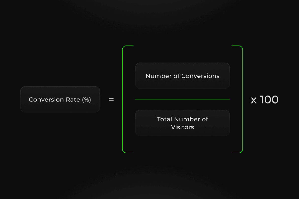
What is a conversion rate?
Conversion rate shows how many people took the intended action — signed up, subscribed, bought. You divide conversions by total visitors. That’s it.
But that number does more than measure. It reflects whether the product made sense to actual users, not just to the team that built it.
You don’t improve by watching the metric. You improve by noticing where people stop and making those moments easier to move through.
Why conversion rate matters for business growth
Marketers often ask why conversion rate is important, because it reflects not how many people arrived, but how many stayed and acted. Understanding user motivation is the first step in learning how to increase conversions, the bridge between curiosity and commitment. More traffic won’t fix a broken flow. If people land and leave, size doesn’t help.
That’s why conversion rate is one of the clearest signals of product health. It shows where the experience guides action — and where it doesn’t.
In 2026, attention is harder to earn and pricier to keep, acquisition costs are still rising. So teams now focus less on volume and more on what happens after the click.
Increasing conversions often comes down to this: less friction, better timing, cleaner copy. Small shifts. Applied often.
Conversion rate formula explained
Conversion rate measures how many users take the intended action — signup, purchase, or subscription. You don’t need a complex system to track it. You need to know the moment that matters and whether it happened.
Technically, it’s conversions divided by total visits, but in practice it’s a checkpoint. A place to ask: are people doing what we expected and if not, where are they stopping?
Average conversion rates by industry
There’s no gold standard. What’s high for one industry might be average in another and what looks low could still be healthy if the product fits the right rhythm.
According to Statista’s 2025 data, most benchmarks fall into ranges:
eCommerce: ~3%
SaaS: closer to 6%
Finance: can reach 8% and up
Travel: around 2–3%, depending on flow
Services: typically 4–5%
Increasing conversion rate comes from removing friction and building steady, meaningful progress, not from chasing higher numbers.
Key metrics beyond conversion rate
Conversion tells part of the story. The rest hides in the before and after.
Where did people pause? What pulled their attention? What stopped them — not dramatically, but subtly?
To increase your conversion rate, you have to look wider:
Bounce rate tells you when someone showed up and left right away.
Scroll depth shows where attention fades.
Click paths map the detours users take when something isn’t clear.
Form drop-off shows where the process felt heavier than the reward.
AOV connects conversion to actual value.
Retention shows whether people came back — or left right after.
When teams study behavior, not just outcomes, they learn how to increase the conversion rate in a way that feels effortless for users. Because conversion rate improvement isn’t just about lifting a number. It’s about learning where the product made sense — and where it asked too much.
Core Conversion Rate Optimization (CRO) Strategies
A strong conversion rate doesn’t happen by chance. It reflects structure — clear pages, focused messages, and paths that make action easy. These are the starting points for teams that aim to increase conversion rates and build consistency over time.
1. A/B Testing That Finds Real Signals
A/B testing replaces assumptions with data. It’s how you see which version actually helps users complete a task — headline, layout, or timing. At this stage, clarity matters more than creativity. Users look for reassurance — total cost, delivery options, refund policy. Reducing uncertainty here often improves conversions more than any visual tweak.
Research from CXL shows that consistent testing on high-traffic pages can lift results by up to 30% over time. The key is focus: prioritize experiments with the greatest impact and confidence, that’s how teams improve conversion rates efficiently.
Each test should answer a single question — does it make the path easier? Progress compounds faster than perfection.
2. Value Propositions That Speak Fast
People move when the value is obvious. Good messaging makes the next step clear without needing to explain it twice.
Examples that improve conversion rates:
“Start investing in 60 seconds.”
“Set your first savings goal.”
“Get cashback when you pay your bills.”
They work because they speak in outcomes, not features. Users understand what happens next and why it’s worth it.
3. Clear and persuasive calls to action
A call to action should fit the moment. It doesn’t have to persuade, it has to lead.
The best CTAs do three things:
Match the user’s current stage.
Describe the result, not the process.
Keep momentum moving forward.
According to Unbounce’s 2025 study, refining CTA copy and placement can boost conversion rates by more than 150 %. Small changes compound fast when they remove hesitation.
4. Simplifying Navigation and Forms
If users have to stop and think about what to click next — you’ve already lost pace.
Good navigation doesn’t draw attention to itself. It just works. Every screen leads smoothly to the next. But when CTAs are buried or menus are overloaded, friction builds fast. Not because something’s broken, but because the direction isn’t clear.
Forms share the same challenge, every field demands effort, and when that effort feels unnecessary, users quietly drop off. For real conversion rate improvement, make the flow intuitive and light.
Research from the Nielsen Norman Group shows that when forms feel effortless, completion rates can rise by up to 30%. It remains one of the simplest ways to increase conversion rate across industries.
5. Mobile Optimization and Responsive Design
Most users won’t be on desktop. And they won’t wait.
Mobile isn’t a second screen anymore, it’s where most actions start. If your page loads slowly, asks for too much, or just feels clunky, people don’t fumble through. They leave.
Mobile optimization means more than resizing. It means:
Forms that work with thumbs
Tap zones that respond
Navigation you can use one‑handed
If you’re aiming to improve app conversion rate, focus on gestures, load time, and readability — the invisible factors that decide whether people stay or leave. Apps like Revolut and Cash App raised expectations here. Their flows don’t feel “mobile‑friendly.” They feel native.
Want to increase mobile conversions? Make sure the full journey can happen right there, in one hand.
6. Reducing Friction in Checkout and Payment
By the time someone hits “checkout,” the decision’s mostly made. That’s why every extra click, field, or delay can undo it.
The most common drop-off points aren’t dramatic. They’re small, frustrating things:
Unexpected fees
Forced account creation
Re-entering card info
Unclear confirmation
According to Invesp, showing progress and security indicators reduces drop-off. Adding payment tools like Apple Pay or Google Pay? Even better.
Some apps take it further and tie rewards to behavior:
→ “Pay on time — earn points”
→ “First top-up — unlock level two”
Improving conversion rates at checkout comes down to removing uncertainty, users commit faster when pricing, delivery, and returns are clear.
7. Ways to Increase Trust and Boost Conversions
Trust is the quiet force behind every completed action. Once it fades, nothing else — not discounts, not urgency — can compensate.
People spot vague language and hidden fees instantly. They scroll more critically now, close tabs faster, and move on if something doesn’t sit right.
If you want to boost conversions, clarity and consistency matter more than polish. Confidence doesn’t come from clever copy. It comes from feeling like the product is built for people — not for metrics.
8. Leveraging Social Proof and Testimonials
When users hesitate, they look sideways. Who else has done this? Did it work for them?
Social proof doesn’t need to be loud. A quote near a CTA. A number showing recent signups. A case study that mirrors the user’s own context. These signals reassure, not by pushing, but by showing.
This kind of proof helps increase your conversion rate, especially for first-time visitors.
9. Using Trust Badges and Secure Payment Options
Security isn’t abstract, familiar badges and clear payment options make safety feel real:
SSL secured with a known provider
“Backed by Visa” or “Powered by Stripe”
“No data sold” near form fields
According to Baymard Institute, nearly one in five users abandons checkout due to trust concerns. Visible badges and recognized payment logos remain among the most effective ways to boost conversion rate. Offering flexible payment options — PayPal, bank transfer, mobile wallets also lowers resistance. Familiarity feels safe, and safety converts.
10. Transparency in Pricing and Policies
Nothing breaks a conversion like surprise costs or vague policies.
“Starting at” pricing, hidden fees, long-winded refund terms — these don’t just confuse. They create friction exactly where momentum should peak.
Good products surface the essentials:
Total price upfront
Cancellation before purchase
Clear, short refund language
Renewal terms in plain sight
When transparency feels effortless, it increases perceived fairness and that fairness directly improves conversion rate over time.
Improving User Experience to Drive Conversions
Clean structure, fast load times, and frictionless flows don’t just feel good, they increase conversion rate without adding anything new.
Faster Page Load Speed
Every second matters. When pages hesitate, users drift.
Fast-loading screens build trust. The experience feels sharp, not heavy. Focused.
Keep interaction responsive:
React to taps instantly
Avoid blank loaders
Prioritize visible content first
Speed supports flow — and that focus leads to a higher conversion rate.
Visual Hierarchy and Design Psychology
Among all conversion tips, visual clarity remains one of the most consistent drivers of user trust and decision-making. Good design guides without speaking. Spacing, contrast, and typography shape what users notice and how they move.
According to Business2Community, it takes about 50 milliseconds (ms) (that’s 0.05 seconds) for users to form an opinion about your website. That first glance often decides what happens next.
Reduce noise. Clarify direction. These are practical conversion rate optimisation tips — and they work.
Personalized User Journeys
Generic journeys stall. Personalized ones adapt. Smart flows adapt to user behavior, offering timely prompts that sustain progress.
A few examples:
Show returning users where they left off
Suggest next steps after key actions
Offer help after repeated hesitation
Dynamic personalization, powered by behavioral data, delivers real conversion rate improvement, McKinsey noting up to 15% higher revenue from personalized experiences.
AI Chatbots and Automation for Engagement
Modern automation keeps momentum alive — stepping in when attention fades and guiding users forward naturally. Well-designed chatbots don’t flood the screen. They respond with purpose: a helpful message, a quiet nudge, a contextual prompt. Like:
“Need help finishing your setup?”
“Want to add a goal where you left off?”
“Ready to pick this back up?”
According to Intercom’s 2024 Customer Service Trends Report, almost half of support teams now use AI to power conversational experiences. When done right, automation becomes one of the most reliable conversion rate optimization tips, guiding users through multi-step or recurring flows naturally. It helps users stay connected without feeling interrupted.
Advanced Conversion Strategies in 2026
The brands that focus on understanding habits and context are the ones consistently increasing conversion rates not through pressure, but precision
Gamification and interactive elements
People don’t need fireworks to stay engaged. But they do need a sense of movement.
That’s where light gamification software helps, when it’s done with restraint. A streak that quietly tracks progress. A small unlock after a task. A message that acknowledges effort without overhyping it.
The best systems don’t shout “win.” They say, “you’re on the right track.”
For products built on repetition — saving, learning, habits — this kind of interaction can make all the difference. You’re not giving users more to do. You’re showing them that what they’ve done matters.
This kind of feedback loop often lifts product conversion, especially when progress is visible and tied to user actions.
Dynamic content based on user behavior
You’ve probably seen it: a user returns to your product after a few days, and everything looks the same. Same layout, same message, same prompts — as if nothing happened.
That’s a missed chance.
When content responds to behavior — maybe they skipped setup, maybe they completed half a flow — it shows you’re paying attention. And that creates momentum.
It could be a changed headline, a reminder block, or a module that says, “you left off here — want to keep going?”
None of it needs to be flashy. What matters is relevance, when a product responds to you, it feels alive. That sense of recognition builds trust and motivation to return and that’s what improves conversion rates, especially after the first drop-off.
Creating urgency and scarcity
Urgency works best when it guides action and helps people make confident decisions.
In the right moment, a little friction can move things forward:
“Only a few spots left.”
“Offer expires tonight.”
“Goal resets in 12 hours.”
Not every product needs this. But where timing matters — events, bonuses, time-bound benefits, clarity helps.
The goal is to give users a reason to act now, not later. When done carefully, these nudges don’t feel manipulative. They feel considerate. And they can quietly increase conversions in moments that usually fade to indecision.
Upselling and cross-selling techniques
Upsells work best when they’re not the first thing users see. No one wants to be pushed into more before they’ve finished what they came for.
But after success or after a small win — that’s when people are open.
You helped someone set a budget? Now’s the time to show investment tools.
They invited a few friends? Now offer referral bonuses.
It feels earned. Timed. Relevant.
Cross-sells follow the same rhythm. Don’t show what’s adjacent, show what fits.
To understand how to improve conversion rate effectively, teams need to map when users are naturally most open to upgrades, right after small wins or moments of progress.
Retargeting campaigns and exit-intent popups
Sometimes people leave because they’re not ready. Sometimes they just got distracted.
Smart retargeting and well-timed reminders are among the simplest ways to show how to boost conversion rate without overwhelming users.
→ “You started a plan last week, want to pick it up again?”
→ “Still comparing options? Here’s what most people choose.”
→ “Your cart’s still waiting, we’ll save it.”
Same goes for exit prompts. The best ones don’t block the door. They hold it for a second.
→ “Want to finish this later?”
→ “Save your progress, we’ll remind you.”
Instead of begging people to stay you’re giving them a way back in. And that is where a lot of conversion rate increase actually comes from.
Common Challenges in Conversion Rate Optimization
A lot of conversion work looks clean in dashboards, but that’s not where the real problems show up. If you’re asking why is my conversion rate so low, the answer usually hides in small mismatches — tone, timing, or flow — not in the offer itself.
What actually hurts performance is quieter: a landing page that doesn’t match the ad, a form that asks for too much too early, a mobile screen that loads just slow enough to lose attention.
These issues don’t always break the funnel, but they drag it down click by click.
Here are four patterns that still derail good funnels in 2026.
Misaligned messaging with ads or traffic sources
You promise one thing. The page shows another. And just like that, the user hesitates.
It might be subtle — the tone’s off, the headline shifts, the layout doesn’t match the expectation set by the ad. But in practice, that’s often enough to stall momentum.
Even strong campaigns underperform when the landing experience feels disconnected. Fixing that doesn’t require big redesigns. It just means aligning the story across the touchpoints — so the person who clicks knows they’re in the right place.
This is how to increase your conversion rate on paid channels quickly and at the lowest cost.
Poor mobile experience
The mobile screen is now the default space for attention, where most interactions begin and end. And people move fast. They won’t wait for the page to load or zoom to hit a button. If the interface resists, they leave. That simple.
The bar is higher now. Mobile optimization means:
Forms built for thumbs
Layouts that don’t need two hands
Feedback when actions happen
No guessing what to do next
Clean mobile flow doesn’t win attention. It keeps it and that’s where conversion rate improvement begins.
Overcomplicated forms and processes
Most users don’t quit forms because they’re long. They quit because they stop making sense.
Maybe they’re asked for information too early. Maybe the logic breaks halfway through. Or maybe the steps just never end — and no one said how many there’d be.
Good forms feel like movement, not work. And the ones that perform best don’t always ask less, they ask better.
Want to increase your conversion rate on signups or onboarding? Start by mapping where people pause, not where they drop. That’s where resistance begins.
Ignoring post-conversion experiences
Someone signs up. Or pays. Or finishes a task. And then… nothing.
No confirmation, no next step, no sense that it mattered. The action’s done, but the experience isn’t.
That’s a missed chance — not just to engage, but to build momentum.
Even a simple follow-through — a thank you, a guide, a nudge — turns a conversion into a relationship. And those small moments can improve conversion rates long-term, because they reduce churn before it starts.
It’s not about over-delivering. It’s about not going silent.
How to Continuously Improve Your Conversion Rate
Improving conversion rates takes ongoing work. Teams that approach it as a system, not a campaign, are the ones that build lasting momentum and that’s what makes the difference.
Collecting and analyzing customer feedback
Dashboards can’t tell you what felt confusing or off, иut your users can, if you ask soon enough.
A short exit poll. A single follow-up question. Even a one-click “what’s missing?” prompt. These small touchpoints reveal what friction feels like on the other side of the screen.
Feedback won’t always give you answers. But it shows you where to look next. And over time, that shapes smarter conversion strategies.
Testing different acquisition and conversion channels
Not all traffic behaves the same. Some users arrive curious. Others come ready to act. The difference often depends on how and where they found you.
Try new channels, but track what happens after the click. Retention, activation, quality of movement, that’s where the real picture forms.
The goal is to find the paths that quietly increase conversion rate while keeping spend in check.
Integrating analytics for deeper insights
Top-level metrics don’t show you where users get stuck. Funnel reports, session replays, scroll depth, that’s where patterns start to emerge. You don’t need more dashboards, you need clearer questions and tools that help connect action with hesitation, that’s where conversion rate optimization gets sharper and less reactive.
Building a long-term CRO strategy
Funnels degrade, products shift. What worked last quarter might already be fading.
Teams that improve consistently don’t chase wins, they build habits. Regular reviews. Focused tests. A clear process for spotting friction before it piles up.
That’s what makes conversion rate improvement sustainable — not speed, but rhythm.
How Enable3 Can Increase Conversion Rate
Real conversion happens in the design of the path, not in the noise around it. Enable3 helps teams turn product activity into forward motion, not with extra layers, but with logic that fits inside what users are already doing.
A mission starts when someone completes onboarding. Another unlocks after a referral. A streak builds with consistent deposits. Each moment becomes part of a larger rhythm — visible, trackable, motivating.
It’s about creating a sense of progress that users can see, feel, and want to continue. Here’s how Enable3 turns these principles into practice.
Why teams choose Enable3
1. Missions that move with behavior
Not rules hard-coded months in advance. Enable3 adjusts in real time — unlocking, re-engaging, nudging, based on what the user does next.
2. A builder that moves at product speed
Launch in hours, not sprints. Teams control logic, timing, and flow without waiting on dev queues or compromising oversight.
3. Rewards that reflect how your product works
Whether it’s points, tiers, perks, or partner triggers, Enable3 lets you define the mechanics and the platform wraps around them, no need to retrofit your structure.
4. Everything under one flow
App, web, CRM, push — all stitched into a single system that sees the full user path, not just isolated steps.
5. Compliance that’s baked in
With privacy layers, fraud checks, and controls that meet enterprise & SMBs standards — quietly, by design.
The platform’s modular design and real-time analytics allow businesses to test, adapt, and continuously increase conversion rates without rebuilding their stack.
Enable3 helps you capture what’s already in motion by turning everyday actions into a steady pattern of progress.
Conclusion: Conversion, Built for 2026
In 2026, the best conversion strategies feel seamless, they guide without distracting and make every step feel natural.
Sustainable conversion comes from systems that adapt, not moments that spike. And it works best when it’s stable, responsive, and easy to follow.
Whether you're running a fintech app, an e-commerce flow, or a digital service, the principle holds: make progress easy to see, value easy to feel, and action easy to take. Improving conversion rates isn’t a finish line, it’s an ongoing rhythm of testing, learning, and refining what drives users to act.
FAQs
How can A/B testing help boost conversions?
Testing reveals what truly drives results, even the smallest changes, like a new headline or layout shift, can deliver meaningful gains.
How can Enable3 improve mobile conversion rates?
By embedding missions, streaks, and dynamic nudges directly into the mobile flow. No extra layers — only a seamless experience that adapts to how users actually behave.
What are common mistakes that reduce conversion rates?
Mismatched messaging, long forms, poor mobile design, and dead-end experiences after signup. Each one quietly breaks the journey.
How do you increase conversion without redesigning everything?
Start where decisions happen. Improve what the user sees first, clicks on first, hesitates over first. That could mean shortening a form, rewording a button, or shifting when and where feedback appears. You don’t need a new page, only a better path through the one you already have.
How do you know if your conversion strategy is working?
Watch what changes. Are more users finishing what they start? Are they moving faster, with fewer drop-offs? Are repeat actions happening without a reminder? When the experience feels smoother and results follow, the strategy is doing its job.